Most blog discovery is chronological, popular, or search-driven. I built a 2D latent space map of 85 posts to see whether spatial navigation could offer a better bird's-eye view of the corpus.
Most blog discovery mechanisms are broken. Chronological feeds bury evergreen content the moment a new year rolls over. “Popular” feeds create feedback loops where the same three posts get all the traffic. Search bars are great, but they require the reader to arrive with a specific intent.
I’ve published about 85 posts, mostly about recommendation systems and ML infrastructure. I wanted to try a discovery mechanism that wasn’t just a list. I decided to build a 2D latent space map of the corpus.
To be clear, I built this mostly for fun. I’m not convinced that spatial navigation is the absolute ideal way for a general consumer to read a blog. But it offers a great bird’s-eye view of how much content there is and how the sections relate. We’ll see if readers actually click on it once there’s more data.
In building it, I ran into four distinct problems: how to embed the text, how to verify my tagging system, how to project it to 2D, and how to actually render it so the UX feels natural.
The vector problem: Chunking and Encoding
If you want to place documents on a 2D map, the naive approach is to pass the entire markdown body into whatever embedding model tops the MTEB leaderboard. This fails for two reasons.
First, technical posts are long. When you embed 2,500 words containing code blocks, tangents, and listicles, the vector gets muddy and drifts toward the mean. I tested five chunking strategies and found that embedding just the Title and a short Summary yielded much sharper semantic boundaries.
Second, most top-tier embedding models are optimized for retrieval (matching short queries to long documents). This creates a latent space geometry that doesn’t always map well to doc-to-doc visual clustering. I used Gemini Embedding 2 specifically because the API has a task_type parameter. By setting it to clustering, the model optimizes for symmetric document similarity. I used 768 dimensions and L2-normalized them so the cosine geometry remained stable.
The difference is easiest to see side by side. I embedded identical chunks twice: once with Gemini’s retrieval-oriented semantic_similarity task, and once with the clustering task. Both were projected with identical unsupervised UMAP settings so the comparison is fair.
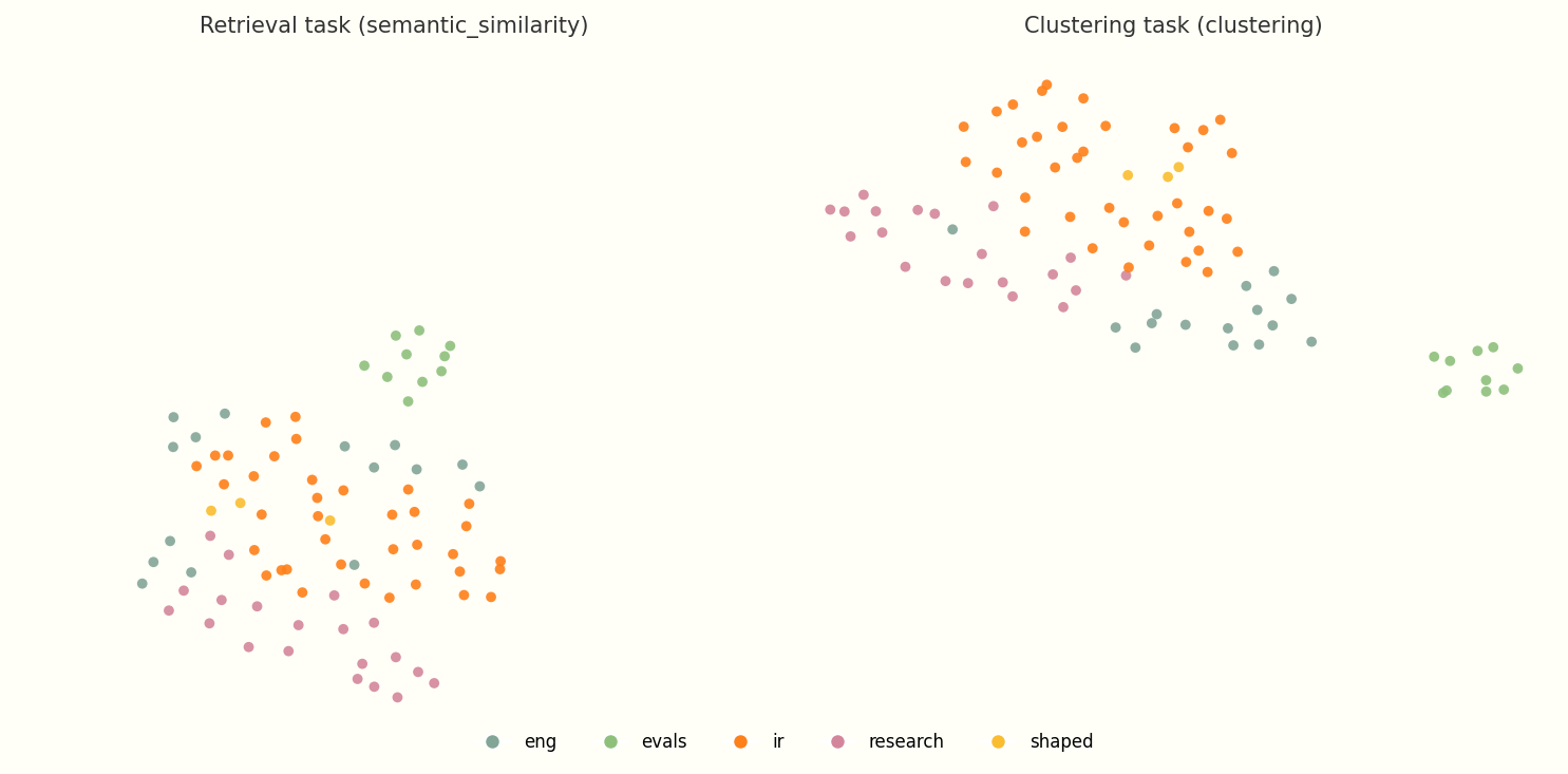
Same 85 posts, same chunks, same UMAP parameters. Colors are editorial tags. The retrieval task optimizes for query-to-document matching, so doc-to-doc neighborhoods blur together. The clustering task preserves symmetric similarity, which is what you want for a map.
The taxonomy problem: Verifying tags with data
I use a few editorial tags for my posts: ir, eng, evals, research. I deliberately chose tags over rigid categories. A post can carry multiple tags, overlap with neighbors, and sit at different levels of a hierarchy. I wanted to know if that taxonomy actually matched the geometry of the corpus.
To check, I projected the embeddings with unsupervised UMAP (no tag supervision) and colored each dot by its editorial tag. This is variant #74 from the sweep gallery: enhanced_abstract chunks, clustering @ 768d, min_dist=0.5, n_neighbors=10.
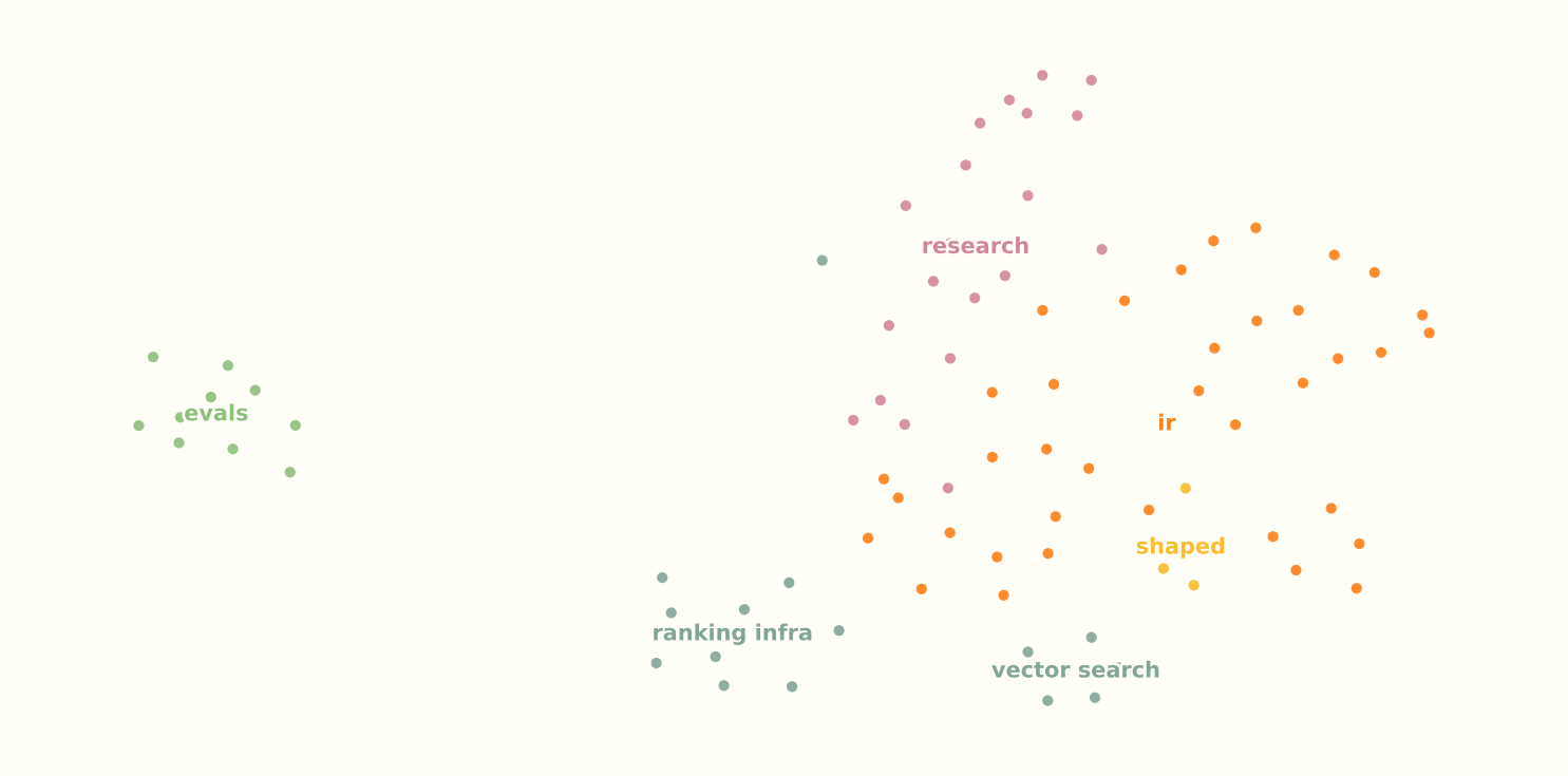
Unsupervised UMAP · enhanced_abstract · clustering @ 768d · min_dist=0.5 · n_neighbors=10
At 85 posts this is a small corpus for UMAP, and n_neighbors=10 is roughly 12% of n, so the projection leans heavily on global structure. I read the finer micro-clusters below with that caveat in mind.
A few things stood out:
evalsposts are clearly separated from the rest of the corpus. Evaluation metrics and offline testing read as their own neighborhood in embedding space.- Everything else sits in one large cluster, but the tags still trace different sides of it and pick out micro-clusters within it. Tags are not mutually exclusive buckets; they mark overlapping regions inside a mostly connected graph.
- The main misclassification was “Research-to-Production” and the
shapedcontent in general (example). Fair enough: those posts are still about IR, they just happen to be Shaped-focused, which the embedding space does not know about. engposts split into two micro-clusters: a vector-store pocket (HNSW, ANN, grep vs vector DB) and a general ranking-infrastructure pocket (serving, MLOps, data layers). If I wanted another tag, something like “vectors” would fit the data well, though it is not strictly necessary.
That was reassuring. The tagging system is at least roughly correct. Because tags overlap and the corpus is globally cohesive, I knew I could not rely on tags alone to carve the map into clean, non-overlapping islands. That is fine. The map should show overlap, not pretend it does not exist.
The projection problem: Experimenting with UMAP
UMAP is notoriously finicky. Small changes to min_dist or n_neighbors can turn a readable map into a hairball. To find something usable, I wrote a pipeline to sweep 648 configs and exported them to an HTML gallery.
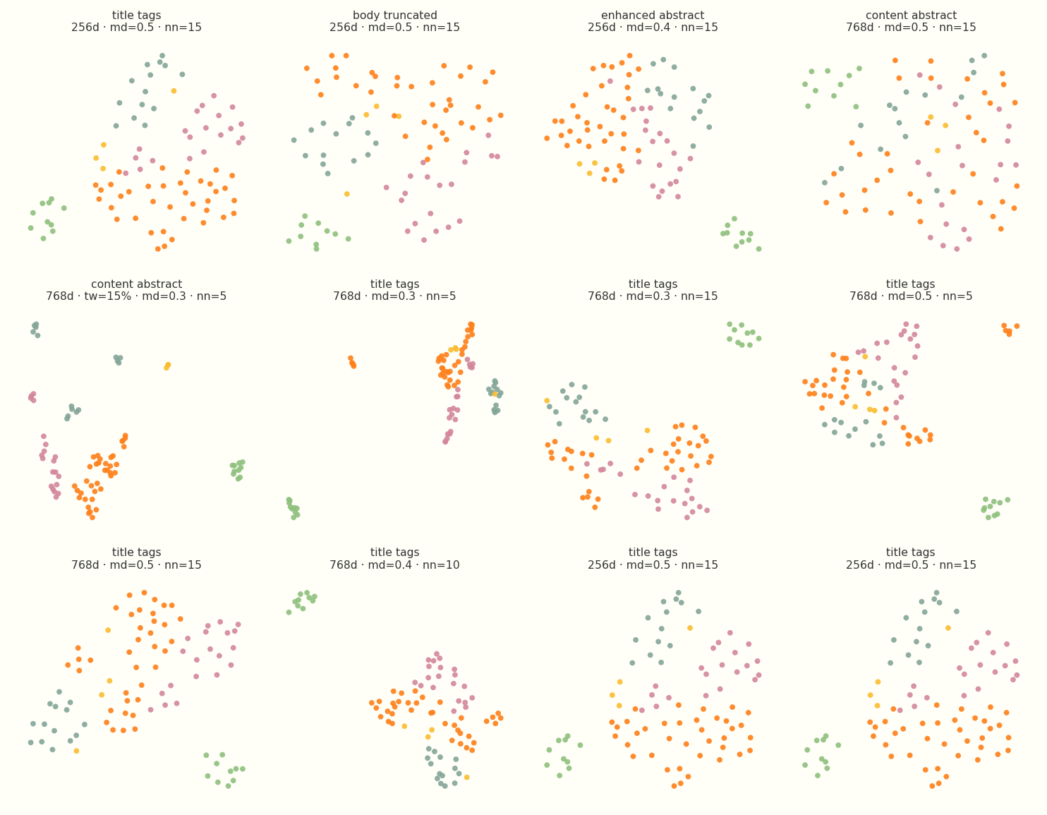
Twelve configs from the sweep gallery. Colors are editorial tags. Chunk strategy, embedding dimension, min_dist, and n_neighbors all change the layout dramatically.
The grid is mostly there to show the range. Some variants are tight worms. Some are scattered clouds. Some chunk strategies barely separate at all. I spent a long time clicking through the gallery before picking anything for production.
For the live map, I ended up using semi-supervised UMAP. It pulls the 2D layout toward the editorial tags you pass in as targets, on top of the geometry already in the embedding space. Because the unsupervised projection above already showed tags tracking real neighborhoods, light supervision sharpens existing structure rather than inventing it. You still get cleaner islands than pure unsupervised UMAP alone, but the labels are nudging geometry that was already there, not stamping out a fake taxonomy.
The goal is a map people can navigate, not a purity contest about unsupervised topology. I used target_weight=0.15, enough to tease tag neighborhoods apart without making the layout feel stamped out by hand. Combined with min_dist=0.45 for legible spacing, that is what ships in production.
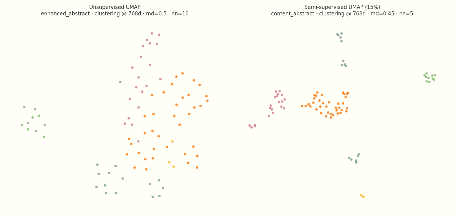
Left: unsupervised UMAP on enhanced_abstract chunks (variant #74 from the sweep). Right: production semi-supervised config (variant-34-md45, content_abstract chunks, target_weight=0.15).
I also tried ranking maps by tag silhouette score, but that metric is a poor fit for this job by design. Silhouette penalizes overlap, and overlap is exactly what the map should show. A post about RecSys evaluation should sit near a post about data pipelines. I chose the final parameters by eye from the gallery, which is the right process when the metric would punish the layout you actually want.
The UX problem: Rendering the neighborhood
I didn’t want to add a 2MB WebGL library to my static site just to render a scatter plot. The entire output of the ML pipeline is a precomputed 30KB JSON file containing coordinates and nearest neighbors. The frontend uses a vanilla script to render it as SVG.
The main UX challenge was placement and context.
On the main /writing feed, the map is rendered full-width. The SVG’s viewBox is dynamically calculated based on the data bounds so it naturally fills the screen without manual aspect-ratio hacks. It acts as the “galaxy view” of the blog.
But on individual article pages, the global view is less useful. The user is already reading a post; they need to know what’s nearby. I placed the map in the bottom right corner of the article layout. The dot for the current post stays bright, its pre-computed nearest neighbors are highlighted, and the rest of the corpus fades out.
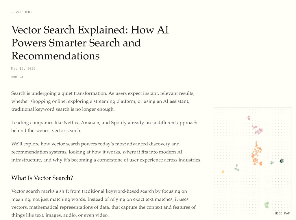
The map on an article page (Vector Search Explained). The highlighted dot is the post you’re reading; faded dots are the rest of the corpus.
(Note: It’s critical that you compute these nearest neighbors in the original 768-dimensional space. If you calculate kNN on the 2D coordinates after UMAP has distorted the topology, you get hallucinated recommendations).
Takeaways
Building this map proved that blog discovery doesn’t have to just be a chronological feed or a search bar. Spatial navigation surfaces the actual shape of the corpus, giving readers a “galaxy view” of the entire site, and a localized neighborhood view when they’re deep in a specific article. It exposes connections and evergreen content that a simple list completely hides.
The biggest lesson, though, was how much experimentation it takes to make an embedding map actually usable. You can’t just pass markdown through an API and expect a good UI. Getting a legible topology meant deliberately fighting the defaults: ditching full-text embeddings for aggressive chunking (just titles and summaries), switching from retrieval to clustering models to fix the geometry, sweeping hundreds of UMAP parameters, and using light semi-supervised UMAP only after unsupervised validation showed the tags already tracked real neighborhoods.
Next steps
With the baseline map in place, there are a few experiments I want to run next:
- Interaction-based embeddings: Right now, proximity is based purely on semantic content. The most interesting next step is blending in collaborative similarity: what readers actually click, read sequentially, or return to, to see how actual reader behavior reshapes the neighborhoods.
- Layering on metadata: Spatial layout solves the topic problem, but it ignores time and traffic. I want to try encoding recency or popularity through visual channels like dot size or opacity, adding those signals on top of the fixed coordinates.
- Expanding the corpus: At roughly 85 posts, the clusters are just starting to stabilize, and some of what looks like fine structure today may be UMAP artifact at this scale. The map will naturally become more useful, and the boundaries more defined, as the data grows. Building it actually made me want to write more.
- Pipeline automation: The current generation script works, but it requires a manual run. The final mechanical step is wiring it into CI so the map’s topology naturally evolves every time a new post is merged.